
The battle of the variants is on! We invite you to join us in the battle between the variants by comparing several versions of webcontent within Umbraco websites. We use uMarketingSuite to set up A/B testing.
With uMarketingSuite you can easily set up tests. Ready to start? After reading this blog, you can optimize your website better, improve the conversion on your website and easily improve your content’s performance!
Ready to start?
By combining Umbraco’s user friendly design based on powerful algorithms, you can set up A/B tests within minutes.
As a marketer, you know better than anyone that there is always room for improvement in this digital world. You want to have insight into the entire customer journey and implement optimizations that contribute to the whole journey and bring conversions sky high! Especially with significant data, you want insights in your results and determine new hypotheses to improve your website and the customer journey.
To achieve the best result and to validate a hypothesis, it is important to test the various options with your audience on forehand. You can do this through A/B testing in uMarketingSuite. This allows you to test two or more components or different pages against each other. The results provide you with proof of what best suits your audience and which optimization needs to be implemented. Ultimately, this should contribute to or increase the chance of achieving a certain conversion as well as targets.
Our A/B test in practice
To give you a better idea of how such a test can be set up and what the result can be, we have set up an example A/B test for you! The goal in this example is to increase conversions of ‘Start free trail’ applications on Umbraco.com. We have created three new variations of the call-to-action button to make more attrative for users and persuade the users more to apply for a free trail.
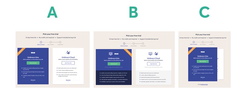
In variant A, we made Umbraco's call-to-action (CTA) clearer using the color green and moved the CTA above the USPs. In variant B, the main difference from variant A is the clear separation between CTA and USPs and extra sub-line below the CTA. Variant C is more 'Mobile first' design and you can switch between products like a wallet client. This is to give one product more empahsize.
The Winner!
This A/B test shows that Variant A has victorious become the significant winner! The conversion rate has increased by no less than 7%. The runner up was the original variant so this example shows that not all variants work better. The results show that a CTA above the USP's where not all USP's were on display appears to work better than separating the CTA from the USP's. Variant A also works better than the design where you can switch between the products like a wallet client. A simple adjustment can lead to major differences, so A/B testing and continuing to optimize pay off! So don’t wait and start testing today!
Conversion and growth!
We hope you learned more about A/B testing from this blog. Did you know that in addition to A/B testing, you can also set up and personalize segments? View our Youtube channel and discover all the possibilities of uMarketingSuite. If you need help or advice, please contact us!
Is uMarketingSuite not running on your website yet? Everything you need to know about installing the package and registering a license can be found here